Monthly marketing report template
A month-by-month marketing performance write-up with channel tables and campaign sections, generated per period from your campaign data.
Free plan, no credit card. Bring your own design or start from this layout.
What’s in this template
Every block is bound to a field in your data. The layout stays exactly as designed; only the values change from one run to the next.
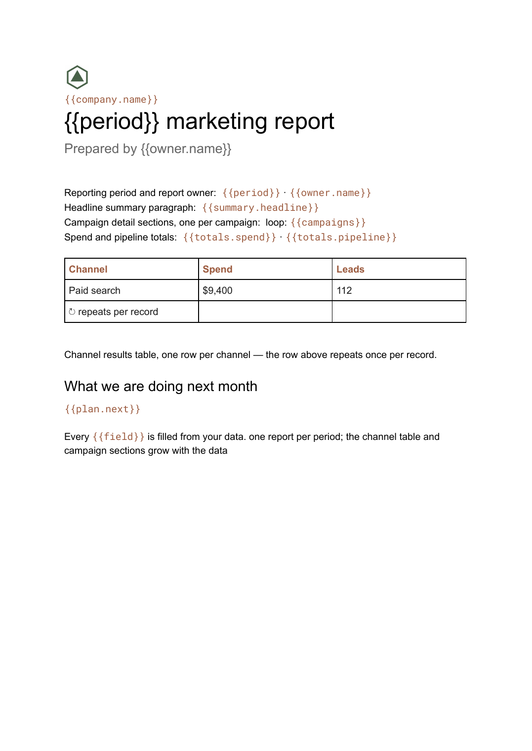
- Reporting period and report owner {{period}} · {{owner.name}}
- Headline summary paragraph {{summary.headline}}
- Channel results table, one row per channel loop: {{channels}}
- Campaign detail sections, one per campaign loop: {{campaigns}}
- Spend and pipeline totals {{totals.spend}} · {{totals.pipeline}}
- What we are doing next month {{plan.next}}
How this template fills itself
Connect Airtable, Google Sheets, a SQL database, a CSV or a REST API, map each field to a placeholder, and generate. One run can produce a single document or one per matching record.
Channels · Google Sheets
Template: Google Slides or Docs
{{period}} marketing report
Prepared by {{owner.name}}
{{summary.headline}}
loop: {{channels}} → table row
{{totals.pipeline}} pipeline
one report per period; the channel table and campaign sections grow with the data
Generated output
DocsPDFAugust 2026 marketing report
Prepared by Dana Whitfield
Lead volume up 18% on July.
3 channels, 9 campaigns
$412,000 pipeline
Who uses this template
In-house marketing teams
Report the same way every month so periods stay comparable and nobody rebuilds the file from last month's copy.
Read the guideMarketing agencies
Run the monthly cycle for every account at once and keep the commentary next to the numbers it describes.
Read the guideFounders and heads of growth
Get a written record of what happened each month rather than a dashboard that only shows today.
Read the guideA monthly marketing report answers one question in writing: what happened, and what are we doing about it. Most teams rebuild it by copying last month’s file, pasting fresh exports, rewriting the commentary and fixing whatever the paste broke. The rebuilding is the waste, not the reporting.
Shape the data so the report can grow
The awkward part of a monthly report is that its length changes. Give the template two repeating sources — a row per channel and a record per campaign — and the document stops being fixed. A month with fourteen campaigns produces fourteen sections and the pages break where they should; a quiet month produces four and the report is simply shorter. Keep the commentary in a field beside the data rather than in the template, so the written judgement travels with the period it describes and a correction is made once, in the data, and regenerated.
Related templates
All reports →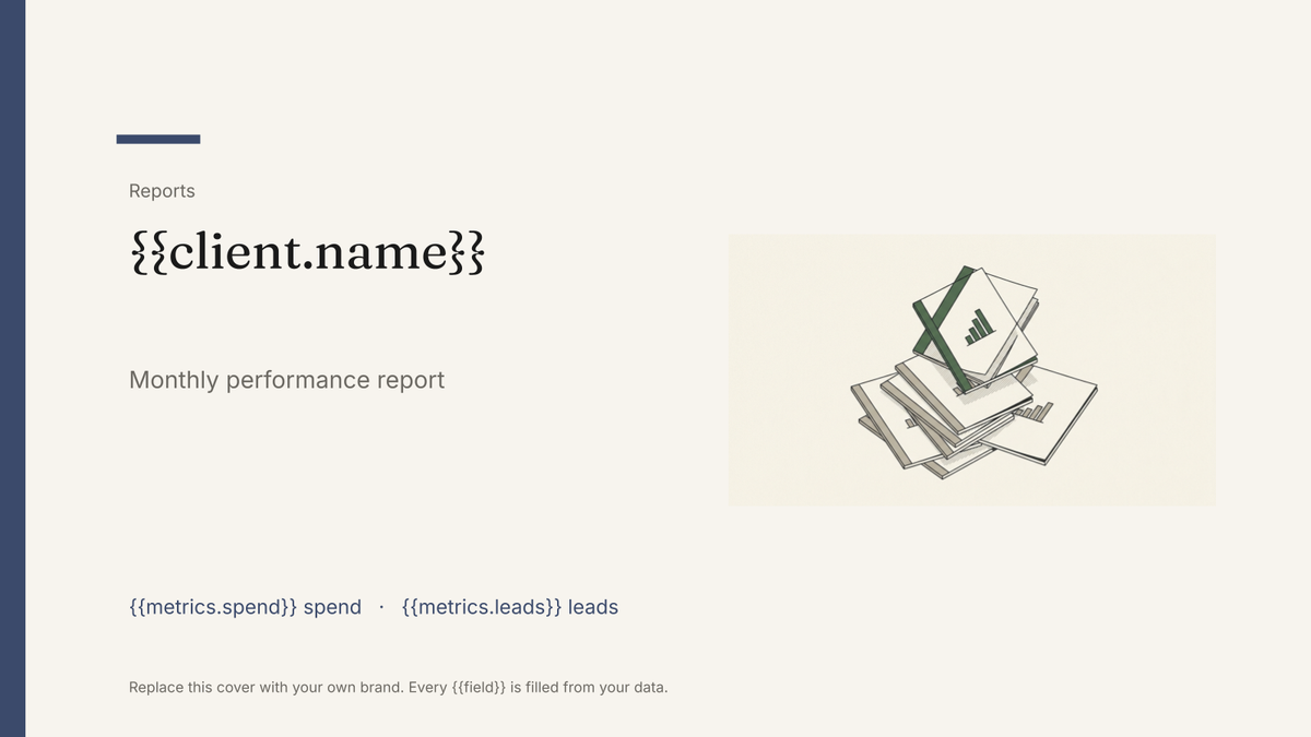 Google Slides
 Agency client report template
A white-label monthly performance report, generated one per client account from your campaign data.
View template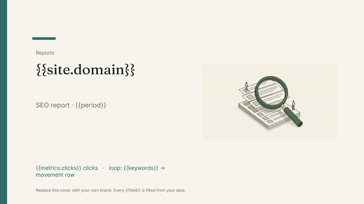 Google Slides
 SEO report template
A monthly search performance report with ranking, traffic and technical blocks, generated one per site from your SEO data.
View template Google Slides
 KPI scorecard template
A one-page KPI scorecard showing target, actual and variance per metric, generated each period from your reporting data.
View template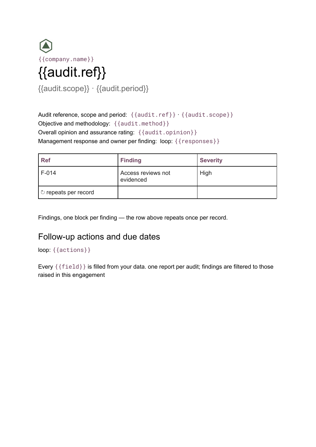 Google Docs
 Audit report template
A per-audit report setting out scope, findings with severity and management responses, generated from your findings register.
View templateCommon questions, answered
Why a Google Doc rather than a deck for this report? +
Where do the numbers come from? +
Who writes the commentary if the report is generated? +
Can I use my own report design? +
Generate this document from your data
Start on the free plan, connect a data source, and export a real Google Docs document. No watermark, no credit card.