KPI scorecard template
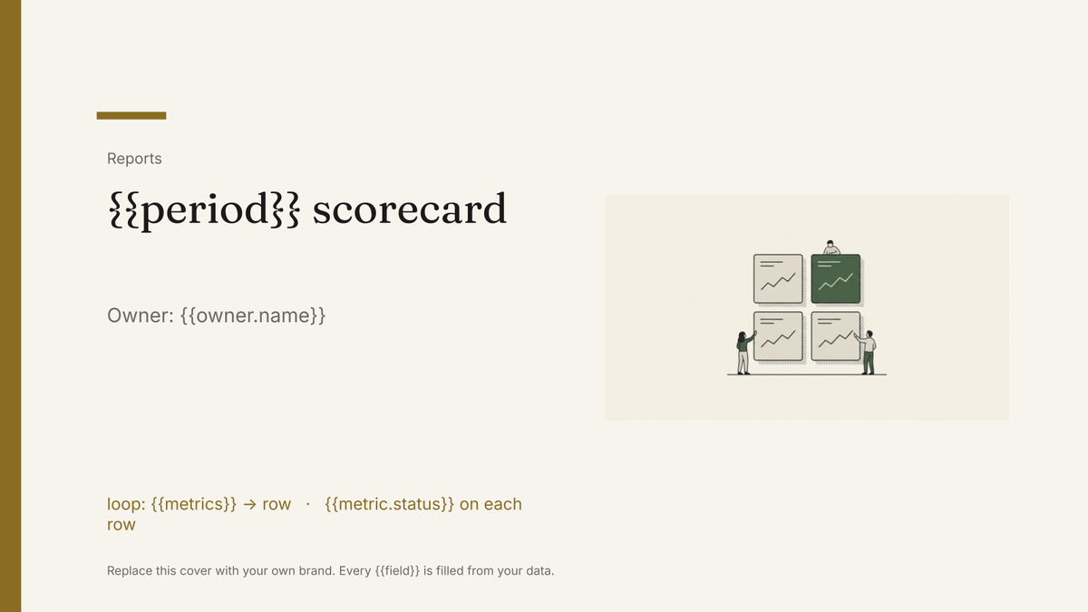
A one-page KPI scorecard showing target, actual and variance per metric, generated each period from your reporting data.
Free plan, no credit card. Bring your own design or start from this layout.
What’s in this template
Every block is bound to a field in your data. The layout stays exactly as designed; only the values change from one run to the next.
- Period and owner header {{period}} · {{owner.name}}
- Metric rows with target, actual and variance loop: {{metrics}}
- Status marker per metric {{metric.status}}
- Movement against the previous period {{metrics.trend}}
- Commentary on the metrics that missed {{summary.exceptions}}
- Actions and owners for next period loop: {{actions}}
How this template fills itself
Connect Airtable, Google Sheets, a SQL database, a CSV or a REST API, map each field to a placeholder, and generate. One run can produce a single document or one per matching record.
Metrics · SQL database
Template: Google Slides or Docs
{{period}} scorecard
Owner: {{owner.name}}
loop: {{metrics}} → row
{{metric.status}} on each row
{{summary.exceptions}}
one scorecard per period; the status marker is read from the variance column in the data
Generated output
SlidesPDFAugust 2026 scorecard
Owner: Dana Whitfield
12 metrics
9 on target, 3 behind
Churn drifted on the SMB cohort.
Who uses this template
Leadership and exec teams
Open the monthly meeting with the same page every time, so the discussion is about the misses rather than the layout.
Read the guideRevOps and business operations
Publish the agreed numbers once a period instead of answering the same questions from four dashboards.
Read the guideAgencies and consultancies
Give each client a one-page scorecard that sits in front of the longer report.
Read the guideA scorecard is deliberately one page: every metric that matters, its target, what actually happened and the gap between them. It works because it is fixed. Nothing moves between periods, so the eye goes straight to the rows that changed colour, which makes Google Slides the right home for it.
Keep the thresholds in the data, not the template
The argument in a scorecard meeting is rarely about the number and often about whether it counts as a miss. Settle that once by holding a status column on each metric row, derived from your own threshold rule, and let the template simply print what the column says. The document then has no opinion of its own: it reports the rule you agreed. It also means a metric added mid-year appears on the next run without anyone touching the design, and a scorecard generated last March still shows the thresholds that applied in March rather than today’s.
Related templates
All reports →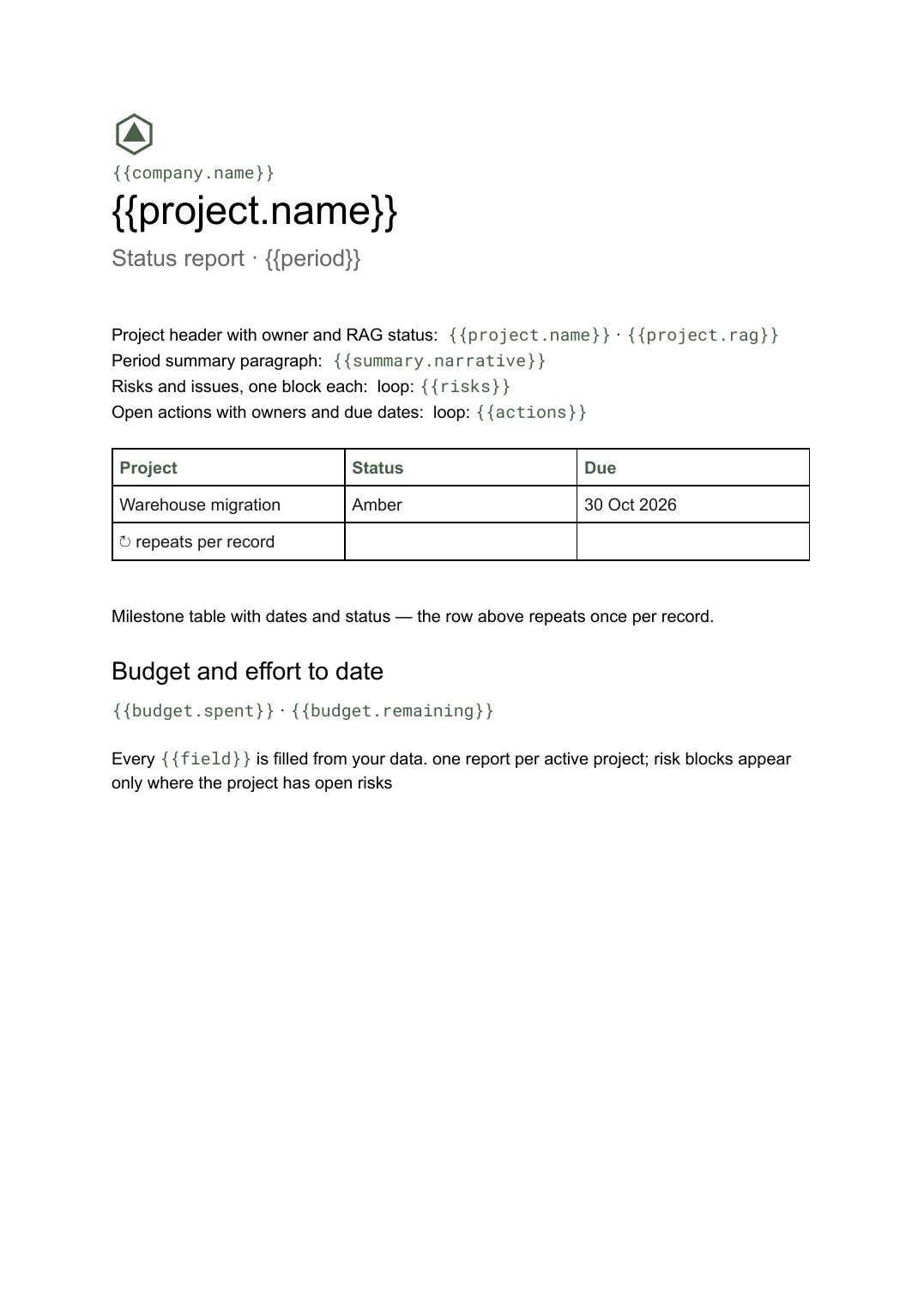 Google Docs
 Project status report template
A per-project status write-up covering progress, milestones, risks and open actions, generated one per project from your tracker.
View template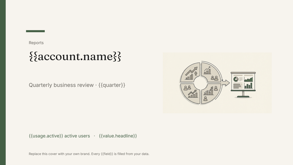 Google Slides
 QBR deck template
A quarterly business review deck covering value delivered, adoption and next-quarter plans, generated one per account from your customer data.
View template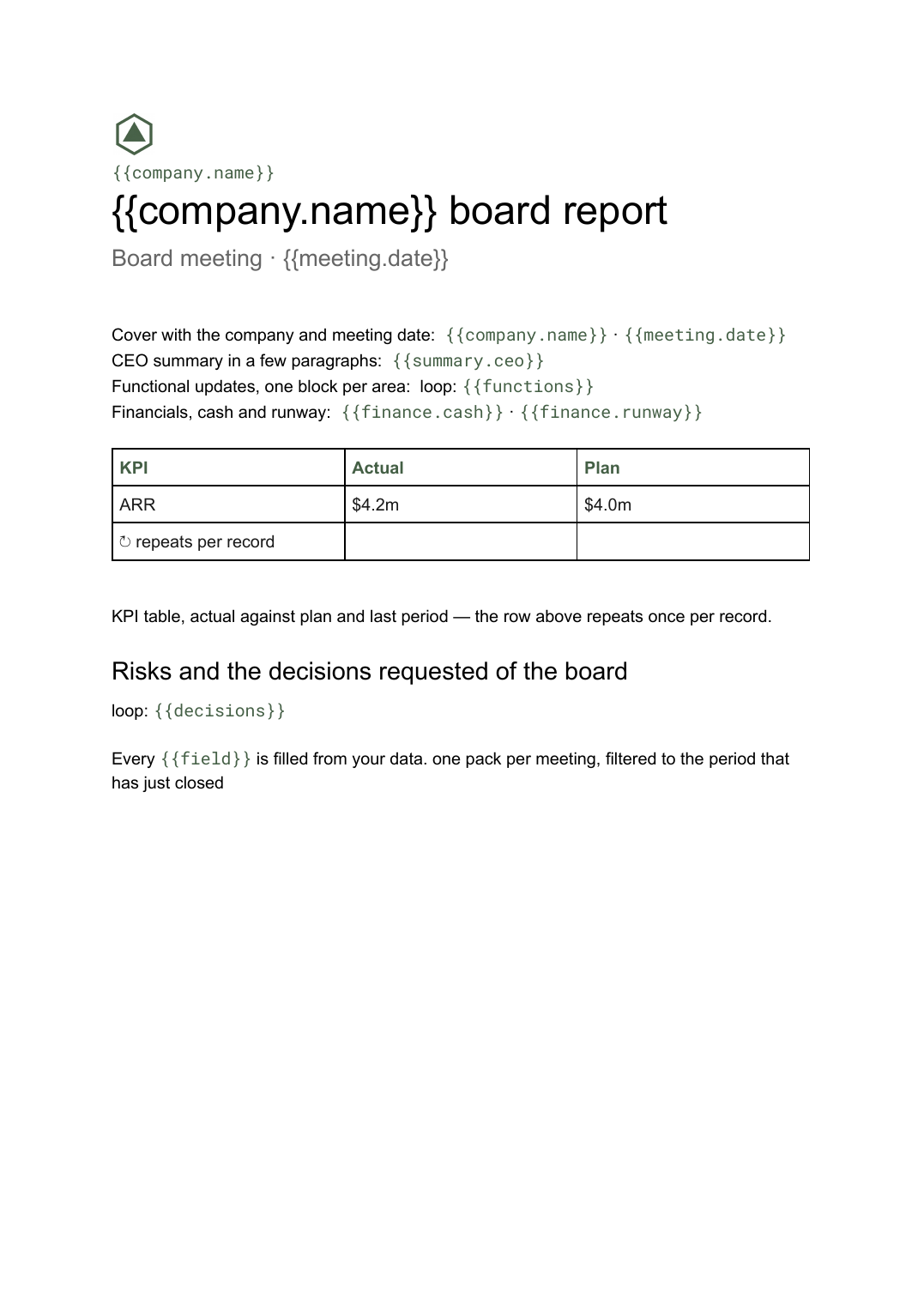 Google Docs
 Board report template
The written pre-read pack sent to directors before a board meeting, generated per meeting from your KPI and financial data.
View template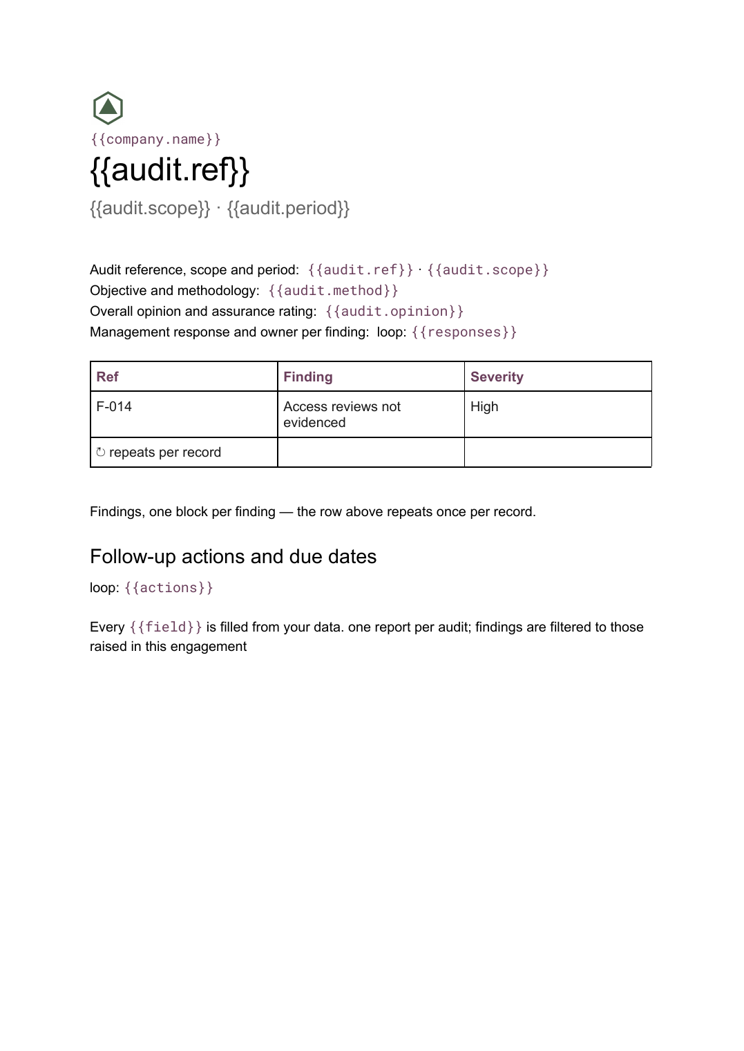 Google Docs
 Audit report template
A per-audit report setting out scope, findings with severity and management responses, generated from your findings register.
View templateCommon questions, answered
Why generate a scorecard when we have a live dashboard? +
Where do the targets and actuals come from? +
Can the red, amber and green markers be automatic? +
Can I use our own scorecard design? +
Generate this document from your data
Start on the free plan, connect a data source, and export a real Google Slides document. No watermark, no credit card.