Impact report template
A programme-by-programme account of outcomes and reach, generated from the monitoring data your team already collects.
Free plan, no credit card. Bring your own design or start from this layout.
What’s in this template
Every block is bound to a field in your data. The layout stays exactly as designed; only the values change from one run to the next.
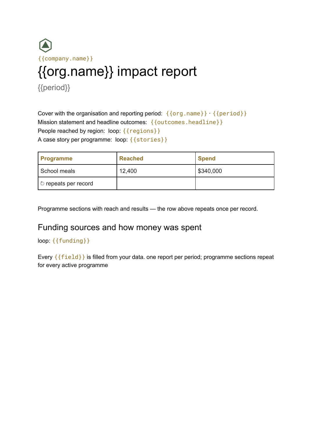
- Cover with the organisation and reporting period {{org.name}} · {{period}}
- Mission statement and headline outcomes {{outcomes.headline}}
- Programme sections with reach and results loop: {{programmes}}
- People reached by region loop: {{regions}}
- A case story per programme loop: {{stories}}
- Funding sources and how money was spent loop: {{funding}}
How this template fills itself
Connect Airtable, Google Sheets, a SQL database, a CSV or a REST API, map each field to a placeholder, and generate. One run can produce a single document or one per matching record.
Programmes · Airtable
Template: Google Slides or Docs
{{org.name}} impact report
{{period}}
{{outcomes.headline}}
loop: {{programmes}} → section
loop: {{regions}} → table row
one report per period; programme sections repeat for every active programme
Generated output
DocsPDFRiverbank Trust impact report
2025–26
16,440 people reached across three programmes
3 programme sections
9 regions
Who uses this template
Nonprofits and charities
Turn the monitoring data you collect for funders into the report supporters actually read.
Read the guideGrant-funded programmes
Produce a differently scoped version per funder from the same programme records.
Read the guideCSR and sustainability teams
Report the year's contribution from the systems that track it rather than from a survey of colleagues.
Read the guideAn impact report has to do two jobs at once: satisfy funders who want numbers against what they paid for, and convince supporters who want to know what changed for people. That mix of tables and narrative, at a length nobody can predict in advance, is what a Google Doc handles and a fixed slide layout does not.
Report from the monitoring data, not a fresh collection round
Most organisations already record reach, spend and outcomes per programme because a funder requires it. The reporting pain comes from treating the annual report as a separate exercise: chasing colleagues for figures that already exist somewhere, in a slightly different form. Point the template at the programme records instead and the report becomes a view of what you monitor all year. It also makes multiple versions cheap, because a funder’s report is the same template with the programmes filtered to the ones they funded, and every version stays consistent with the others.
Related templates
All reports →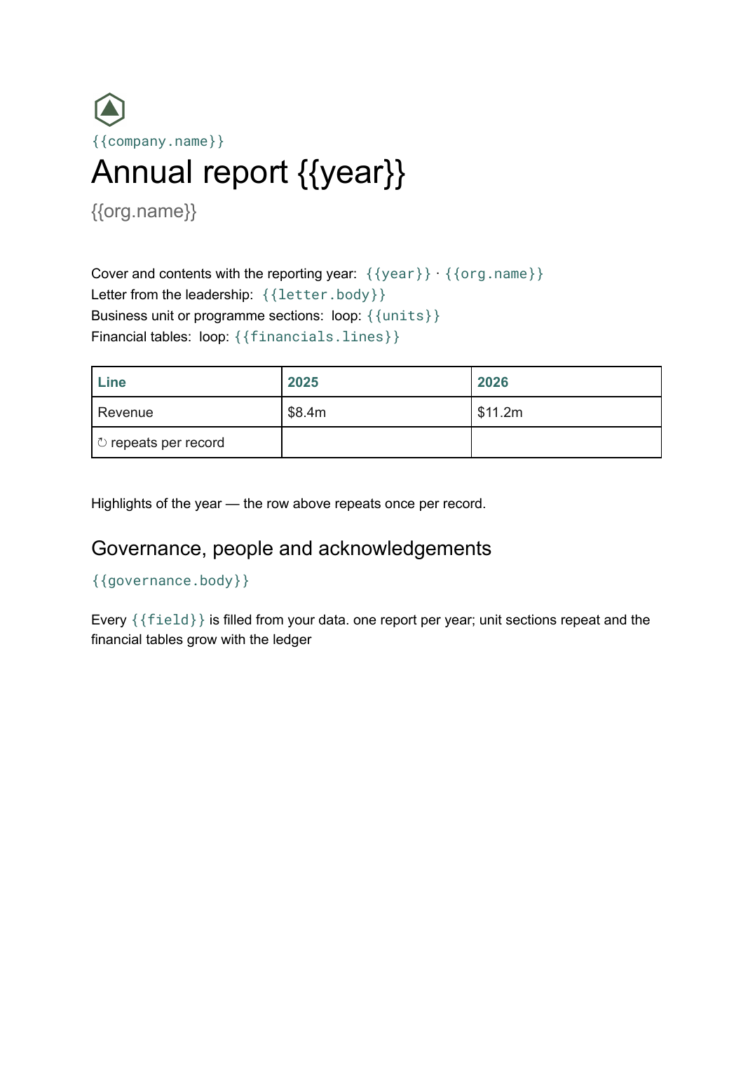 Google Docs
 Annual report template
A year-end report combining narrative sections and financial tables, generated from the year's figures held in your systems.
View template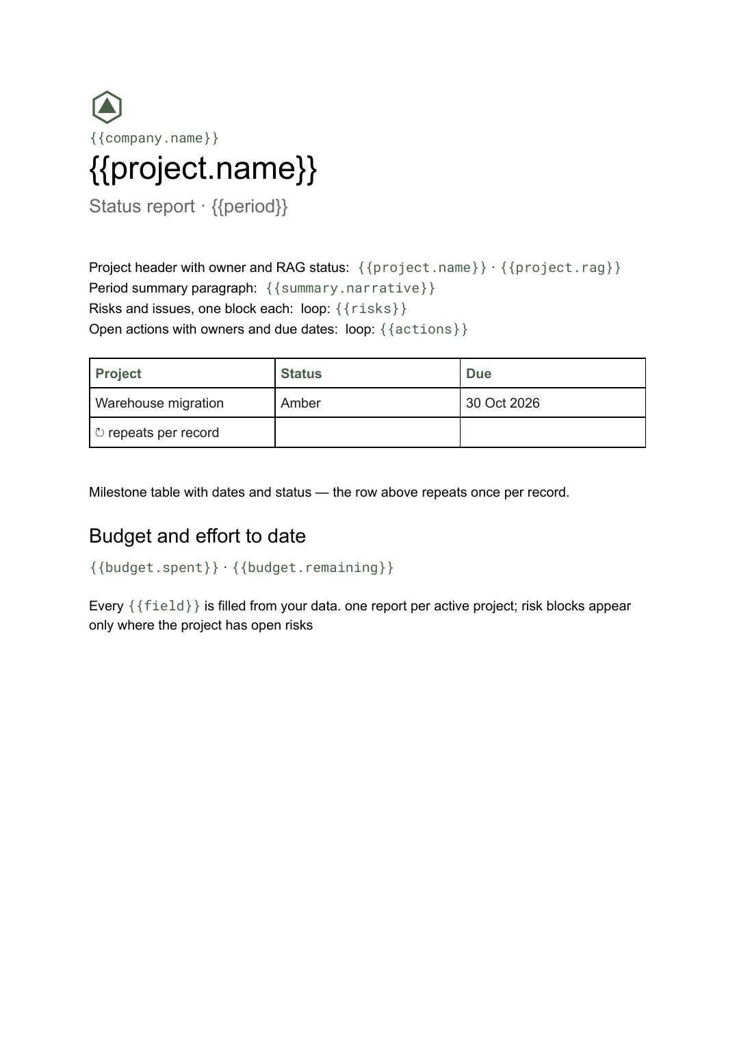 Google Docs
 Project status report template
A per-project status write-up covering progress, milestones, risks and open actions, generated one per project from your tracker.
View template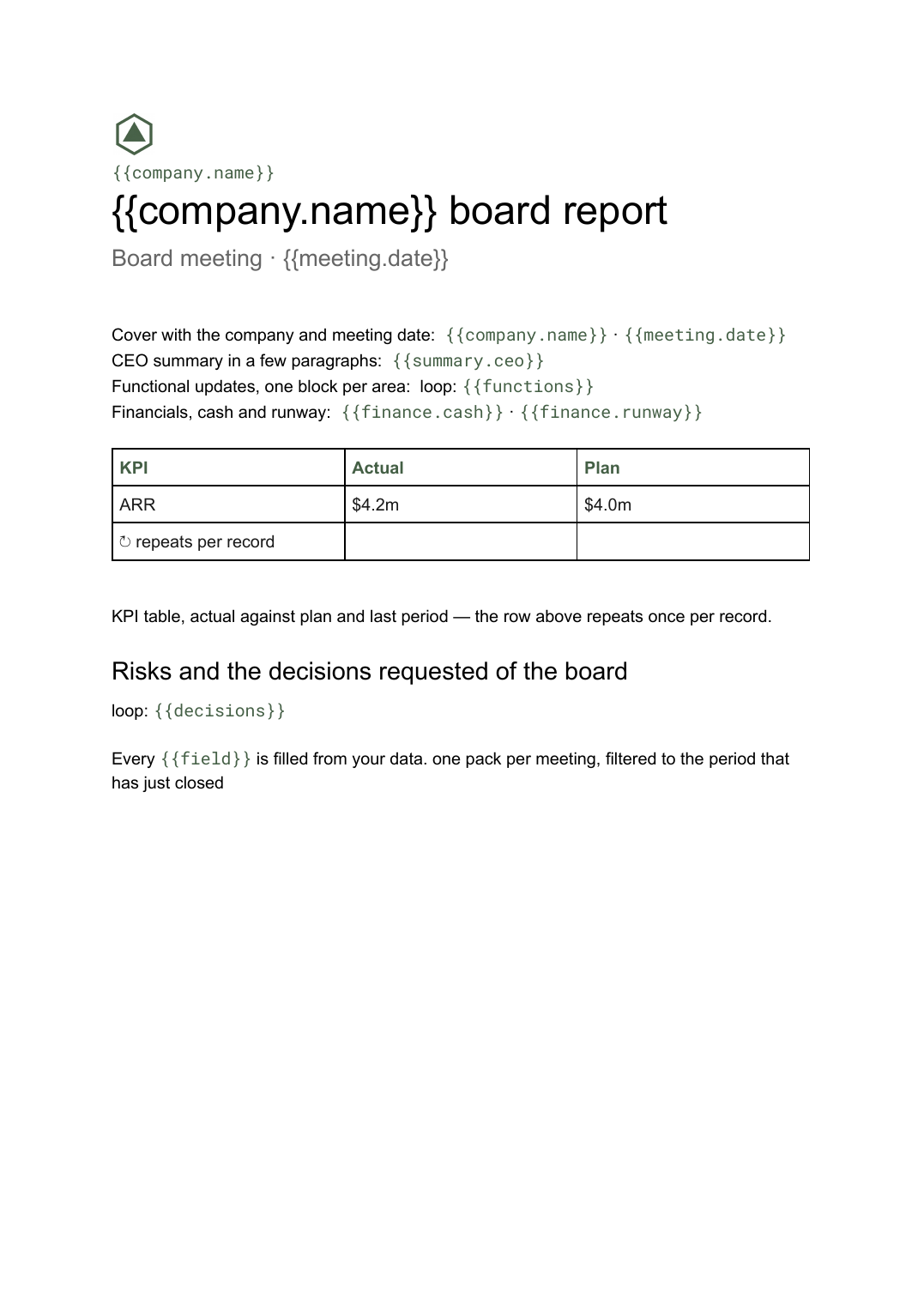 Google Docs
 Board report template
The written pre-read pack sent to directors before a board meeting, generated per meeting from your KPI and financial data.
View template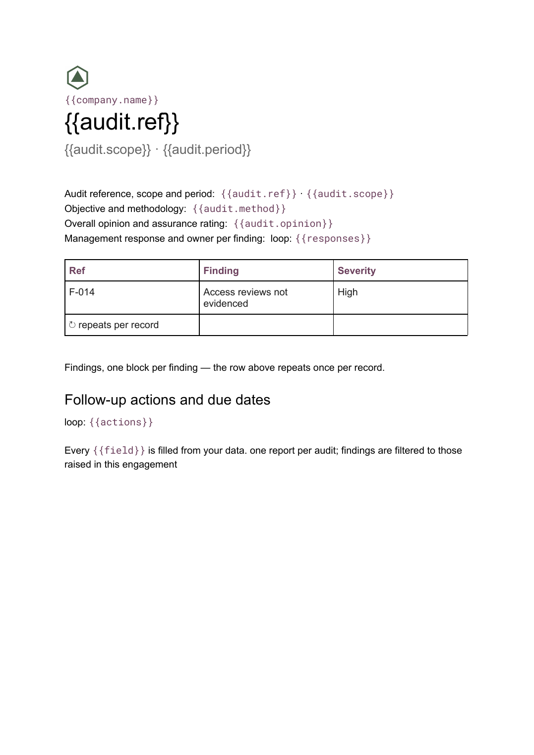 Google Docs
 Audit report template
A per-audit report setting out scope, findings with severity and management responses, generated from your findings register.
View templateCommon questions, answered
Can I produce a different version for each funder? +
Where do the reach and spend figures come from? +
Where do the stories and quotes fit? +
Can I use our own impact report design? +
Generate this document from your data
Start on the free plan, connect a data source, and export a real Google Docs document. No watermark, no credit card.